
 If you’re reading this post on your phone, you probably noticed something a little different about my blog.
You no longer have to pinch and zoom to read my content.
I finally have a responsive design. That simply means it adjusts to fit small screens better.
(Yes, I know…. took me long enough, right?) 🙂
If you use The StudioPress (Genesis) themes, you probably know they are in the process of making all their themes responsive, but I got tired of waiting for The Genesis Lifestyle Theme to get its makeover.
I was willing to wait until I emailed customer support for a time estimate and discovered it would be some time before the project was complete for all themes.
So I made the decision to switch to the Prose theme (yes, that’s an affiliate link) — which is one of their child themes that is already responsive. (Update 2014: I now use the Daily Dish theme.)
Update October, 2013: Yay! The Genesis Lifestyle Theme is now responsive!
If you’re not a techie, don’t worry. There’s no code you have to edit to make your site responsive. It’s part of the theme.
Now if you’re not interested in buying a theme, you don’t have to. I’ll talk more about that below.
Have You Checked Your Site’s Analytics?
Depending on your visitor demographics, it is quite possible more than half of your visitors are viewing your site on a mobile device today (especially if you get a lot of social media traffic).
And if you have a site with a lot of forms (which can be a pain to complete on smaller screens), you really should consider going responsive sooner than later.
Some predict we are only a couple of years away from mobile browsing beating desktop browsing, so ensuring your site displays optimally in all resolutions is more important than ever.
How to Make Your Site Mobile Responsive — The Options
As I stated, you don’t have to get a new theme if you don’t want to. There are plugins that will do a pretty good job of making your site responsive.
WP Touch is probably one of the most popular ones because it works with most themes — and it’s free!
I didn’t want to use a plugin because then I would be relying on a script outside of my theme to work properly. Plus, I wanted the mobile version of my site to look similar to the desktop version.
WP Touch strips out all your styling and uses the same template for all sites. But I will say, it does handle AdSense ads very nicely.
Using a plugin is not a bad idea, but I think it’s best to actually have a site that is coded to adjust for mobile devices.
That’s why I went with the Prose theme.
And of course, there are other companies that make mobile responsive designs — such as PageLines, Themeforest and Headway to name a few. (No affiliation since I’ve never used any of these themes.)
What About Outsourcing?
If the above options don’t meet your needs, you can always outsource the project.
In fact, I did just that for my HTML site, but I made a big mistake that I hope you can learn from.
I found a designer on Elance to do the job. He quoted me a very reasonable price of $75.
At first, he was going to charge $250, but when he realized he wasn’t going to build the site from scratch, he lowered his quote — which I appreciated.
Within two days the job was done and even though I was pretty happy with how my site looked, there were some tweaks I wanted to make later.
I was headed out of town and didn’t want to hold up the job any longer. In other words, I rushed the process.
Since I’m pretty good at tweaking CSS code, I paid him the $75 and planned to make the remaining edits myself.
Well after I started editing his code, I still couldn’t get the site to look like I wanted.
Instead of rushing, I should have taken my time and made sure it looked exactly how I wanted BEFORE I paid him.
The guy was nice enough. I probably could have contacted him for more tweaks after I paid him. But it was my fault for not ensuring the site looked how I wanted before paying him.
So here I am, out of $75 and still unhappy with how my site looks on certain mobile devices. 🙁
Hello Prose!
I decided to give up on the static site for the time being and focus on this blog since I knew StudioPress (Genesis) has some responsive themes.
So I browsed their site and decided upon the Prose Theme. (Update: I now use The Daily Dish theme.) It looked a lot like my previous theme, and it also has a lot of admin panel design options so you don’t have to edit the code to change the font styles, sizes, colors, etc.
It sort of reminds me of Thesis 1.0.
So I took advantage of the “current customer” discount. I bought Prose for only $26 and had the theme up and running in just a few minutes.
I even learned how to tweak the stylesheet to hide certain sections of the site in lower resolutions.
Look out! 🙂
Could I Use This Theme on My HTML Site Too?
Then I got really bold. I wondered if I could somehow use the code from this theme on my NON WordPress site too.
Just out of curiosity, I grabbed the source code from this blog, pasted it into Dreamweaver and low and behold the site displayed perfectly in my software!
So I made some tweaks (actually I made a lot of tweaks that took me a couple of days) and figured out how to work the code into my existing layout.
Quite honestly, I would NOT recommend this route if you’re not familiar with code. Either switch to WordPress or hire someone to do the responsive design for you.
Whew, what a task that was!
Nevertheless, both of my sites now use the Daily Dish theme.
Hiding Certain Site Elements in Responsive Mode
One cool thing about responsive design is you can opt to hide certain parts of your site when viewed on smaller devices.
For example, if you want to remove the footer widgets from the Prose theme in smaller resolutions, you simply add a line of code to your theme’s custom.css file. See the highlighted text below…
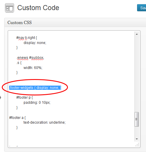
So basically, you can take any element (#header, #sidebar, etc.) of your site and apply your own style for the responsive view or remove the element completely by adding the display: none attribute.
AdSense and Responsive Designs
I have to give a shout out to my forum member, Charlie, from CodeConquest.com for bringing this up.
If you use AdSense, it’s very important that you never, ever hide your AdSense ads in a responsive design. It’s against the terms and conditions.
As my forum moderator, Paul from Technically Easy explains, even though you are hiding the ads from readers, the javascript still runs.
That means it’s registering as a page view so advertisers could be paying for page views that they aren’t receiving because you’ve hidden the ads.
So please, please do not hide your ads or you could be in trouble with AdSense.
On a slightly different note, Google has officially modified their “Modifying Ad Code” policy. Now you can edit your AdSense code to make your units adjust accordingly when your site is in responsive mode.
But don’t take my word for it. Read it on the official AdSense blog.
Here’s a more in-depth tutorial on how to make your ads responsive.
I have yet to test this, but looking forward to experimenting now that Google has modified their policies.
What Does Google Say About Responsive Design?
You may be wondering what Google has to say about making websites mobile friendly. Here’s a quote taken right from their Developer’s site.
Google recommends webmasters follow the industry best practice of using responsive web design, namely serving the same HTML for all devices (as opposed to having a mobile and non-mobile version) and using only CSS media queries to decide the rendering on each device.
Now, don’t let the techy jargon throw you. A media query is just a statement in your theme’s style.css file (stylesheet) that says, “Hey, if someone is viewing this page on a resolution that is less than X, display the layout this way.
Back in the day, (which is only about 5 years in Web time), people would have completely separate sites designed for mobile devices. But thanks to CSS3, you can now use media queries.
So when it comes to WordPress, themes that are considered “mobile responsive” simply add those queries to the existing stylesheet or use a separate one to tell the browser how to behave.
How to Preview Your Site on Multiple Devices/Resolutions
If you want to see how your site looks in multiple resolutions, here is a cool tool that I have become very good friends with in the past week. 🙂 You can also use ScreenFly.
Just put your site URL in the blank and see how it looks on smaller devices.
If your site is not responsive or “mobile friendly”, it will look as if it’s cut off in the lower resolutions. Don’t worry, most devices will just size the layout down to show the full site.
Users can pinch and zoom to adjust the size of the text.
What Do You Think of The Responsive Trend?
As trendy as responsive websites seem to be now, some critics believe it’s all hype. They say most people don’t mind pinching and zooming when browsing a site on their phone.
While that may be true for many content websites, browsing certain sites is a complete nightmare when they aren’t responsive.
Sorry, but I am NOT going to pinch and zoom my way around an order form where the drop-downs or certain features are nearly impossible to select.
For certain kinds of sites like ecommerce or gaming, a responsive design is almost a must today.
In my case, one of the reasons I was slow to adopt the responsive trend is I didn’t have a very large percentage of mobile viewers.
But I’m starting to see those percentages creep up. I’ve even received some comments about how difficult it was to read my posts on certain phones.
Also, my own preferences began to change.
Two years ago, I didn’t really mind pinching and zooming to view a site’s content on my phone.
But as more sites started going responsive, I got spoiled and began to really appreciate it when a site loads nicely on my iPhone.
So I jumped on the bandwagon. 🙂
I still have some tweaking to do with regards to my sidebar content, but the overall site is much easier to read on smaller devices.
What about you? Have you gone responsive? What theme are you using? If not, why?
Hello Lisa,
How did you get around the issue with Prose images, videos and header being cut off on mobile devices. The theme is not fully mobile responsive and I’m looking for a fix. Any genius ideas you can share? Cheers. I use Prose on all 6 of my websites and have just got rid of WPTouch and want to make the Prose work properly.
I don’t use this theme anymore since they no longer support/update it. However, if you google how to make your images responsive, there should be some quick CSS code you can add to your pages to fix that. Not sure about the video though. I don’t remember video being a problem.
The other solution to the images is to remove the width and header attributes in the code. Not ideal for page loading though.
Nice to know that information but now there are many theme selling online and the price very cheap it has already customize with mobile phone already. however I still thank you for this information. I will design it by myself.
Hi Lisa, Amazing Post! I’m reading in Sep 2015, and see you antecipate what happended in market
Thanks Lisa Great Infor from You…
may i must try WP Touch plugins for my site
unwilling if it should replace the existing themes because the audience may not like the new look on the desktop version
once again thanks..
regards
Hi Lisa,
I always look carefully at my analytics for my websites, and I am seeing a steady increase in mobile traffic for them all, and now a significant chunk of the traffic is mobile. So having a responsive site is essential now, or you could be losing a big chunk of traffic. Google has recently brought out an update that negatively affects sites in mobile search that are not responsive, so it really should be a priority to make your site responsive if it is not already. I personally use WordPress for all my sites, and most new themes are all responsive now, so it is very easy to comply with this.
Hi Lisa! It’s my second time visit your website. I really understand what this article mean. I thought that becoming a responsive website is just because this time a lot of people more use their mobile phone that desktop PC.
Hi, Lisa!!
I also use a responsive theme on my blog and it works great. Recently, google has an update for this.
And responsive theme has become more and more popular and important.
Wow Lisa, you have no idea how helpful this post is. I am not a designer but offer SEO for customers and with Google rolling out a Mobile update. Mobile is now a increasingly important factors and I just had no idea how to find a easy solution for customers with a smaller budget. WP Touch seems like a great solution for companies on a budget.
I guess your main website uses includes that mirror those includes found in a WordPress theme? So that would be header, sidebar, content, and footer.
I am trying to visualise how you would have pasted in the divs to each of your includes. Impressive work Lisa!
When I first did this and switched to the Prose theme, my static site was 3 columns and Prose was only 2 so that was a BIG mess. Can’t believe I figured it out.
But when I switched from Prose to Daily Dish, it was easier because I had two columns. So I just opened up the entire code for the WP theme in Dreamweaver and then had to figure out where the header ended, sidebar began/ended, footer started, etc. Then I pasted the header code into my existing header include, sidebar code into the sidebar include etc. It was a big project.
Although responsive is getting popular, if you’re audience is not using smart phones and tablets it will be waste to change it. I have a friend where his audience are 40-60+ and when he redesigned his website, his traffic went low. Those audience are not used to changes and it really cost him.
Or it could be that the change to the responsive site significantly altered the architecture of the site. If his sitemap was altered as well then that could have cost him search engine traffic.
thank you for info Lisa
More than half of web browsing is *not* done on desktop monitors anymore. I have been designing responsive-only since 2012 and am glad I did!
Hello Lisa,
I receive more than 75 percent of traffic from the mobile users. And one thing is definite that if the blog is not optimized for mobile version then there will be lots of loss in traffic as well as conversion of blog. Great article, thanks for sharing.
Hi Lisa,
I have the latest version of prose and I uploaded a custom header. However the header image is not responsive on mobile devices, it gets cut off. Did this happen to you? How did you fix it?
Hi Amy
Download this plugin http://designsbynickthegeek.com/plugins/genesis-responsive-header-customizer-update It will make your header responsive. That’s what I use here.
Thankyou!!! ^_^
Hi, Nice post for me, Thanks for sharing. I have changed my wallpapers blog theme to responsive as I have noticed that a lots traffic is from mobile and tablet. Thanks again.
i am using a responsive theme on my blog but it loads a lot slow… can you give me some tips on making it super fast?
Thank you, Lisa!
Great content About responsive blog or website.I think now everyone should make their blog or website responsive because it is going to help the user in all aspect and user feel happy when he or she open a website or blog in mobile and it open normally as in laptop .
I would love your feedback of my site.
Hi, Lisa!
Just wondering what you have done about converting your theme to HTML5 with the Genesis 2.0 upgrade. (Yours may be one of the themes that has already been converted.) Poor person that I am, lol, I converted the sample child theme to use on the Genesis framework and now I am facing having to convert the theme myself, which I am loathe to try to do. Any easy way to do this?
Hi Patti
Rob Cubbon has a great tutorial on how to do it and it’s very easy. Your other option is to just wait until Genesis updates your theme. They are doing all of them eventually. So it’s up to you if you want to wait or do it now.
Here’s his video. https://www.youtube.com/watch?v=TSbCzemBDio
Thanks, Lisa! Really appreciate your help!
Hie Lisa,
Good Post, Thankyou Lisa for giving such useful advice, after reading your post i thought OMG, what i was doing? I never thought of these things that you’ve told your website theme should be Mobile/Cellphone responsive, you literally opened my eyes thanks a ton again 🙂 now m gonna look for these things as soon as possible.
-Piyush Dhiman 🙂
Love Genesis’ new responsive child themes! They load super fast too! I think migrating your site to a responsive theme is one of the top 3 foundational on-page SEO moves you can make right now
Me too! Just installed Magazine Pro on another site and absolutely love, love it. Can’t wait until all of their themes have converted over to HTML5 and responsive.
I am also using Genesis Prose theme for my blog.It is really Good
I want to make money on Google Adsense i need help.
I think the most important thing for one’s success is insisting. One may fail, may fall behind the others. But if he keep insisting, all the new knowledge he will finally learn and all the difficulties he will finally beat.
I dont like to create differents pages for my Site on Multiple Devices/Resolutions because this way you can really confirm how you site will open in each new device that is coming new every day, but i know is really needs and just let me do it the best way.
That’s from your tips one more time!
Lisa you know the key that how to entertain your readers with your really attractive articles. Last month I designed mobile friendly theme for my blog but as am not expert with CSS so its shows in normal text mode
I love your articles Lisa, this is the second time I read this article alone on “Mobile Friendly Sites”. And have referred this article and your website to several people, as great reading. Great work, keep it up. I’m going to keep browsing your site, see what’s new. Thank you, Xavier
thank you Lisa I have been chasing my tail for years now following this and that and really getting nowhere but now that I have the time to be patient with myself I can learn and get a niche to build on securely I like your info site and look forward to learning lots more Thanks for having such a welcoming site
Hey lisa.. i am using a responsive theme on my blog but it loads a lot slow… can you give me some tips on making it super fast?
I would contact the developers about that. Do you have a lot of plugins loading? That can slow it down.
Appreciate the tips. Will look forward to follow them accordingly.
Thank you Lisa for this insightful post. Unfortunately I have found out that my website is not mobile responsive. Think I’m gonna try Genesis themes. Just had a quick glance at the themes, and all of them are slick and really beautiful.
having responsive template is a must for every business website. As in the mobile world, people prefer to use mobiles and tablets on the go. A responsive template keeps your users happy and attracted to your content on every type of mobile devices.
While making a template responsive, one should check the live preview through http://www.studiopress.com/responsive module.
I noticed a great boost in traffic of one of my online MBA courses website after adding custom mobile templates to it..
I am also using Genesis Prose theme for my blog.It is really awesome.Good theme for bloggers who loves good content.
I have just bought Genesis framework and all of its child theme. I know Genesis is very responsive to mobile devices. The problem I am facing current now is that Genesis shows all of my post to grid. I don’t like this. I want to show my posts in homepage as single posts. I can’t figure out how to do that? Anyone, please help me.
Thanks Lisa for your wonderful post. It forced me to buy Genesis framework.
Which theme did you buy TechMunna?
I meant what “child” theme did you buy?
I have not deployed it on my blog . I have selected eleven40 may be.
Each theme comes with its own set of customization instructions so they probably tell you how to disable that homepage layout if it’s an option. I asked because if I owned the theme I could help but since I’ve never used that theme I’m not sure.