Sometimes it’s the smallest changes that make the biggest differences. How many of these practices are you implementing on your blog right now?
Is Your Site Fully Responsive?
Just because you have a responsive theme, doesn’t mean every part of your site is mobile friendly.
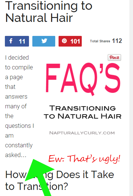
Look at the image below…
This is an iPhone 6 screenshot from an article on my hair site. This right-aligned image looks great on a desktop, but it looks ugly on a mobile device because of how the text wraps.
And with 70% of my nearly 200,000 visitors per month coming from mobile now, this is something I need to keep tabs on. Unfortunately a lot of my older posts have images aligned like this.
Even though a recent WordPress update promised to make images more responsive, check some of your older pages. You may still find they need adjusting… especially if you’ve aligned them manually in WordPress.
I’ve made a commitment to put images on lines by themselves without alignment — as opposed to left or right-aligning them.
I’m in the process now of auditing my older pages so images look better on mobile browsers.
Don’t forget to check your site on your smartphone from time to time. I’ve unearthed some ugly surprises thanks to large images that are outside of the margin and awkward wrapped text.
If you notice an image that is outside the margin of your site and throwing your entire site out of whack, you can remedy this by removing the width and height parameters in the HTML code.
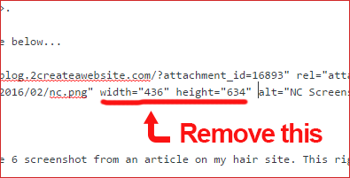
Some themes render correctly on their own, but if yours doesn’t, then that’s one way to fix it.
From a page-loading perspective, this could have a tiny impact. However, most people have high-speed Internet access today, so it’s less of an issue.
What The Font?
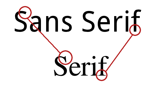
Do you know the difference between Serif and San Serif fonts?
No worries. I didn’t until about 3 weeks ago.
San Serif fonts don’t have tails on the letters and are actually better for Web browsing. They look a lot cleaner and will give your site a more modern look.
Image Source: TheRealKatie.net
Many themes and image editors like Canva are now using Sans Serif fonts and keeping up with the font trends. Here are the top 10 Sans Serif fonts.
Speaking of Canva, check out my video below on how to design an image template for your site in only 2 minutes!
It’s amazing how Canva makes a non-designer like me look like I really know a thing or two about design, right?
Gotta love it!
OK…now back to the topic.
If you need fonts for your graphic program or text editor, download them from 1001Fonts.com. I use them all the time to add fonts to my computer for Photoshop use.
You can sort by Sans Serif fonts and view them all at once. The ones with the green price tag are free for commercial use.
Looking for a different font for WordPress? This tutorial will show you how to add custom fonts to your site.
And if you want to learn how to pair fonts in your images, check this out.
Use Big, Bold High-Res Images
Images help break up your text and they breathe life into your content.
But nothing says “amateur” like a low-res, grainy image!
Ew!
If you need some eye-catching, high-res images, check out Gratisography by Ryan McGuire.
You can use the images for your personal and commercial projects and they are 100% free!
Yes, you read that right. They are free and with no attribution required! See for yourself.
Hurry and download them before Ryan changes his mind! 🙂
I love using a nice big lead image to start my posts. These are great for social media, but I also find them incredibly fun to create.
Also play around with font pairing to make your image pop even more.
Write Shorter Sentences and Paragraphs
I want you to notice something.
Isn’t it much easier to read my content when I break the text up like this?
Now read the paragraph below…
As you begin reading this, notice how bad this looks when I don’t break my content up? Don’t laugh. People still write like this. I bet you’re already starting to feel overwhelmed and drained by this looooooooong paragraph. You’re probably still reading, but only because I’m making a point and you may be curious about what I’m going to write next. And if you’re reading this on your smartphone…oh boy… God help you. 🙂 I know your eyes want to cross, skip around or at least take a break. Long paragraphs are a turn-off to our eyes and minds because the fast-paced, digital world has forced us to desire quick consumption. We like to scan and speed read through articles. So if you’re still writing your paragraphs like this, please stop. Start breaking up your content more. Your readers will thank you and probably read even more of your content.
Are you cross eyed yet?
My bad. Just trying to make a point. 😉
Don’t forget: A 4-line paragraph might look fine on a 27″ monitor, but that same paragraph turns into 10 or more lines on a smaller device.
White Space is Your Friend
I remember when website owners were seemingly afraid of white space. Too much of it was perceived as dull and boring.
Now we associated it with professionalism, cleanliness and it’s practically become a design standard.
Today it’s all about larger margins, adequate line spacing and shorter paragraphs. All create white space to make your site easier to scan/read.
Write For Humans. Not Google.
Remember the good ole’ days of article generation software?
For the newcomers out there, you could buy software to churn out keyword-optimized content that would hopefully rank on Google.com.
What about calculating keyword density?
Just think. We actually counted how many times we used a specific phrase we were targeting to help with search engine optimization.
Now that SEO has changed, I spend much less time on keywords and more time ensuring my blog has a casual, consistent tone.
So relax…
Be you!
One thing I love about blogging is it’s much less formal, and gives us a license to write in a more casual format that brings out our personalities.
That’s what makes it fun!
If you don’t enjoy blogging and it seems like a chore, do some exercises to help find your own voice.




Hi Lisa,
Thanks for your great efforts, I’m a regular reader of your blog. I think we should increase PA and DA to improve our blogs.
Hey lisa,
This post is excellent I learned a lot of things about some pressing common problems on my site after reading this. I have a small blog and facing image mobile responsive issues on my site. After reading this article, I checked my blog post images on my smartphone, and it looks terrible. And immediately I contacted my website, designer; they fixed my site designs. Your posts are helpful.
Thnaks
great post lisa seeing changes on my blog now
Great Post Lisa! 🙂
Well written. Very informative and useful for me.
Hope this article helps my site to improve.
I will indeed follow all the steps.
Looking forward for such lovely posts.
whitespaces. yeah that was missing out.
These tips are awesome! I love Canva and I can definitely back you up on using it for your social media posts.
Hey lisa,
As usual this is a fantastic post, I love love love it!!
Thanks for sharing such great stuff, I have learned a lot!
Thank you for commenting and sharing on Twitter Shaun!! ???
hey lisa,
Your welcome when there is great content to be shared I am on it!!!
The part about content reminds me of the old school bulletin board systems where that was all you had…text content without any pictures.
Content, I would imagine would be more useful than backlinks.
Hi lisa.
A very interesting useful information..and very helpful for me..thanks for share.
I’ve run into the same kinds of problems with WordPress. That’s why I decided to host my site and Wix.com. It’s not perfect, but at least I get to design my site the way I want.
Hey Lisa,
I think the White Space and Writing for Humans and not for SEO is sooo important.
Gosh, I remember when I started 8 years ago I was so into KY stuffing and bolding KY phrases.
It was really sad.
Also, until I started doing Email Marketing I really did not understand the concept of not writing in bunched up paragraphs.
To spread it out and show some “white Space” as you say is the best most effective way to do it 😉
Good stuff and thanks for your insight 🙂
Overall I love a lot of these. I do have a minor problem with the white space thing, but that’s because of all those years of writing for things other than blogs. It kind of freaks me out when I visit blogs where each sentence is a paragraph; ugh. It goes counter against everything I learned in school all those many, many years ago. Over the years of blogging I’ve learned to try not to have paragraphs of more than 3 or 4 sentences but that’s as far as I can go! lol
Wow!
Lisa you’ve got brains, lady!
A lot of little things we neglect that have huge impact on our blogs. Thanks for the revelation about the font differences.
I was a bit worried about removing html image properties. Will that not have an effect on load speed? Looks time when you don’t specify image sizes, browsers will require more time to calculate before rendering them.
what about that?
Hey Enstine!! You must’ve missed my mention of page speed in the article in that tip. It may impact slightly but now that so many people are on high speed it’s less of an issue. Ten years ago I would not do it but Im OK with that now. Especially if you optimize your images. Glad to see ya here.
I am regretting so much why didn’t I visited this site before because these are some of the best writing tips and the site you shared for free images deserves a big thank you.
LOL! Well, better late than never, right? Welcome!
All the best to you.
Look forward to your other posts
I love the idea of using white space like that. I never thought of it that way.
Hey Lisa!
These are all great tips and I agree. I’ve always used San Serif fonts because they’re just cleaner looking and more flexible. Never liked the Serif fonts because they’re just too “curly q” for my taste. My favorite San Serif fonts are ‘ABeeZee’, ‘Raleway’ and ‘Lato’,(all Google fonts), but ‘ABeeZee’ has my heart right now.
Regarding the free Hi-Res images, check out Unsplash and Pixabay. Some of the images on Unsplash are just unbelievable – love them!
Gotta a couple of questions for ya.
(1) I love the “NEVER MISS A POST” CTA that appears at the end of your posts. Are you using a After-Entry widget for that are did you create it yourself? I remember you saying, in one of your Podcast last year, that you would be focusing more on advancing your coding and designer skills (and BTW, it shows, because your website looks great).
(2) Regarding your Comments section: How did you set it up to “be notified if someone replies to your comment only” – are you using a special plug-in?
Anywho, that’s my “two cents” for now. Thanks for all the tips!
Hey Lizzie!
Great to see you here as always.
First, thanks for the compliment on the site! Yeah I’ve been tweaking things here and there. 🙂
I’m gonna check out those fonts and image sites you mentioned. Thanks!
The “never miss a post” box is the Hybrid Connect plugin. Not recommended. They are no longer selling it and supporting it (I just found this out last week) so I wouldn’t recommend that now.
Yes, for reply notifications I’m using the Subscribe to Comments Reloaded plugin.
Oh yeah, I was the one who gave you the “heads up” about that HYBRIDCONNECT link. Wouldn’t you know it – one of my favorite things about your site – and the plugin is not available. Well, I’ll just keep reading your stuff because I know you’ll find something else that’s just as good, or better.
I’ve been playing around with my site. It’s not live yet but I’ve got it on local using XAMPP. I know you love InstantWP and I tried it years ago. But XAMPP seems to be more compatible with the Genesis Framework, (now that’s just me), I don’t want to discourage anyone from using InstantWP because it is good – especially if you’re using the WordPress.org free themes. Another thing is that the local setup for InstantWP is much easier than the local setup for XAMPP. Setting up XAMPP locally (the right way), can be a pain because it requires so many more steps.
BTW you are so right about those SEO plugins (from another post you wrote). They are so bloated. Every time I attempt to use one of them I feel like I need to go out and get a box of GasX. I will not be using them on my site.
Anywho, thanks again for the feedback – and GREAT tips!
Oh that was you! lol How quickly I forgot. lol
That’s so good to know about XAMPP. I think the setup is what discouraged me before. You’re right. InstantWP is so much easier but I have also found incompatibility issues with StudioPress.
I am dying over your GASX analogy! Hilarious!!!! Yes they are pretty bloated indeed.
Yeah, that analogy was funny – but TRUE!
XAMPP is so much better for the Genesis Framework. Otherwise, I wouldn’t have taken the time to set up XAMPP. It had me so frustrated it times, I would just stop, go in the kitchen and make a pot of coffee and come back to it.
I kept missing little things and I would say, “wait, that’s not right”. Then I’d go back and start over to see what I missed. I think I was just a bit too eager to get it setup and get going.
If you decide to use XAMPP, install it on your desktop, not in your program files. There are too many “user permission” roadblocks and it’s just not worth the trouble. The installation on my desktop works just fine.
“See” you later…
You had me at Free High Res!!! Hahaha. Thanks Lisa for the tip. You nailed it. I always write my content with spacing. I know exactly what you mean when they are bunched together like that. I am all too familiar with that part.
Heeeey Eddie!
I’m telling you. It will make you go cross-eyed won’t it??? OMG!! lol
Hi Lisa!
You’re a Genius! You’ve put the thing right again with this post! And thank you for calling spade a spade. How I need this shovel-o-logy to explain me all these I.M. and S.M. issues as I’m often lost among the tons of sophisticated jargonic blah-blah-blah.
I think I love you. Ha! Ha!
This comment made me smile, Krystian (love your name and spelling, by the way!) Glad I could help. 🙂
Lisa, you handled that brilliantly – HAHAHA!
Good Day to you Lisa,
I’m going to give you a “heads up” on an error noticed in this post at the end of this comment.
I know you’ll be glad to know about it. No worries, it’s simple, easy to fix and sometimes requires “another set of eyes” to find.
Mobile Responsive:
I’m so glad you’re talking about paying attention to what our “mobile responsive” theme is doing on those “smart” phones.
Personally, I’m “old school”. Touch screens seem to have a “mind of their own”.
I so wish our phones could have “printed” menus, like our larger screens. I’m always getting lost. Even worse, many times we’re off on a “mystery tour”, and don’t even know what happened. Having poor eye sight only worsens this.
Does anyone know of a way to make all those “dots” and “symbols”, actually revert to our good old “printed labels?
In spite of these issues, whenever I publish a new page or post, that same smartphone helps me find errors not seen double checking my work on the larger screen.
Using two-step authentication, when logging into WordPress, for example, is the other “best use” for my smartphone.
The above mentioned functions are more important (for me), than the phone app.
Gratisography:
Just added to my “Image” folder in my Favorites.
Awesome! Thanks!
Short Paragraphs:
I like to keep my paragraphs “shorter” than “longer” too.
It helps break up my “long winded comments” too, don’t you think?
Love the cross eyed image!
Thanks for including it!
It helped “uncross” mine!
Writing for Humans:
Never could figure what those “bots” wanted.
Congratulations on reaching 200,000 visitors per month!
Ooops!
Now for the “heads up” on that ever so small error:
Location – In the Second Line of the Third Paragraph under the heading “WHAT THE FONT?” the sentence is in BOLD – Error – The word “They” is repeated. – “They they”
See, I told you it was an easy error to make.
Fortunately, also an easy and quick fix.
By the way, after posting this comment, I’m going to Twitter to Tweet this post.
My Best to You
Arth
Appreciate the heads up on the typo Arth!
Sometimes Lisa I want to marry you….great post and thanks for the tip off for the free high-resolution pictures, a-mazing.
You are too funny! Thanks Stephen.
Thanks Lisa!
I was always afraid of the white space but now I´m using it more and more.
200.00 visitors? Congrats!
Best to you
I was too, Ricardo. I remember about 3-4 years ago I always thought more color was best but now I prefer a more minimalistic theme.
Thanks Lisa! That image site is crazy… looking forward to using. Keep doing you.
Hi lisa my quetions about affiliafe marking ifi work for some companies sayfor hair products is there a limit to how many companies you can do?
Hi Felicia,
No limit at all.
Heyyy there Lisa! Great tips here chica. Loved the one about whitespace.
Lordy its such a pain reading blog posts where all of the text is jumbled and is not easy to scan.
Oh and 200,000 visitors per month (mouth hits the floor). That is super awesome. Wishing you a grand week.
P.S. Dafont.com is a site that also has a ton of free fonts avail for use.
Cheers Lisa!
Hey Kim! Oooooh yes! Thanks for mentioning whatdafont. I use that site to sometimes. 🙂 Forgot all about that one. Hope you enjoyed the game last night. I wasn’t happy Cam lost but oh well!
Hey Lisa! Whatdafont….. (HAHAHAHA)…too funny! Yeppers I wanted to see Cam win the super bowl too, but Carolina was just not ready for Denver’s defense.
Glad you’re well though chica. 🙂
Oh crap! That actually is a site to check and see what font someone used. LOL! Got my sites mixed up. Yes, Denver kept Cam in check for real!!!