It’s time for another review!
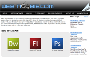
This time I chose WebNoobie.com – a site that offers a variety of video tutorials on PhotoShop, DreamWeaver and Flash. To watch the review, simply click the image below or this link.
If you would like your site reviewed by me, learn how to submit a request.


I checked the site out, good but it’s adobe-centric
Well done. I took your advice and put in some key words of titles I had. Guess what all the same thing out there not much to look at. So thanks this is going to be fun.
I’ll check that website out. I need some good tutorials on how to update my website a little bit.
The site has huge potential. Its a library of information; but its navigation is poor.
When I’m looking for a topic specifically about vanishing points I shouldn’t have to go past page one. There needs to be a list on 1 page or MOVE THE SEARCH TO THE TOP OF THE PAGE! LOL. (Sorry, I thought that should have obviously been at the top)
They need to center the template.
And there needs to be more of a contrast from the topics and the topic description. (Possibly just bold the topics)
Other than those few things, like I said the site has huge potential and I will definitely be going back learning as much as I can.
(PS: the Design Pyramid section was very random.)
Nice review Lisa. Personally I am not that impressed with the webnoobie site but that is mainly because I think the navigation for the tutorials are too similar and therefore nothing stands out. But I see that it is a brand new site and because of that I must admit that it is off to a great start.
Mikael Rieck’s last blog post..How to Make a Fortune on EBay
i think i got all the notes i could before my hand fell off well done lisa
Hi Lisa,
Haven’t started watching the video yet but spotted something: the Title of the Page is still Ritas-Outback-Guide.com
:-))
Eszter’s last blog post..Weather in Jordan l Jordan’s Climate l Best time to visit Jordan
Whoo good catch, thank you! I always forget to update my meta title tag in the browser when doing these. 😀
Another great video Lisa! WebNoobie.. nice concept for a website, would be cool if it was centered in the middle of the page though.. left screen alignment is so 90s! Just my preference 🙂
ThemeGrrl’s last blog post..ThemeGrrl Is Moving WebHosts
Great review Lisa.
As I watched the video I was making mental notes of a bunch of things I need to rework on my site. That’s the whole point of the reviews right. Now I have more work to do…thanks a lot Lisa :[ lol
J. Yahshar’s last blog post..Quick and Easy E-book Covers in 3D